Wednesday 5th October 2022
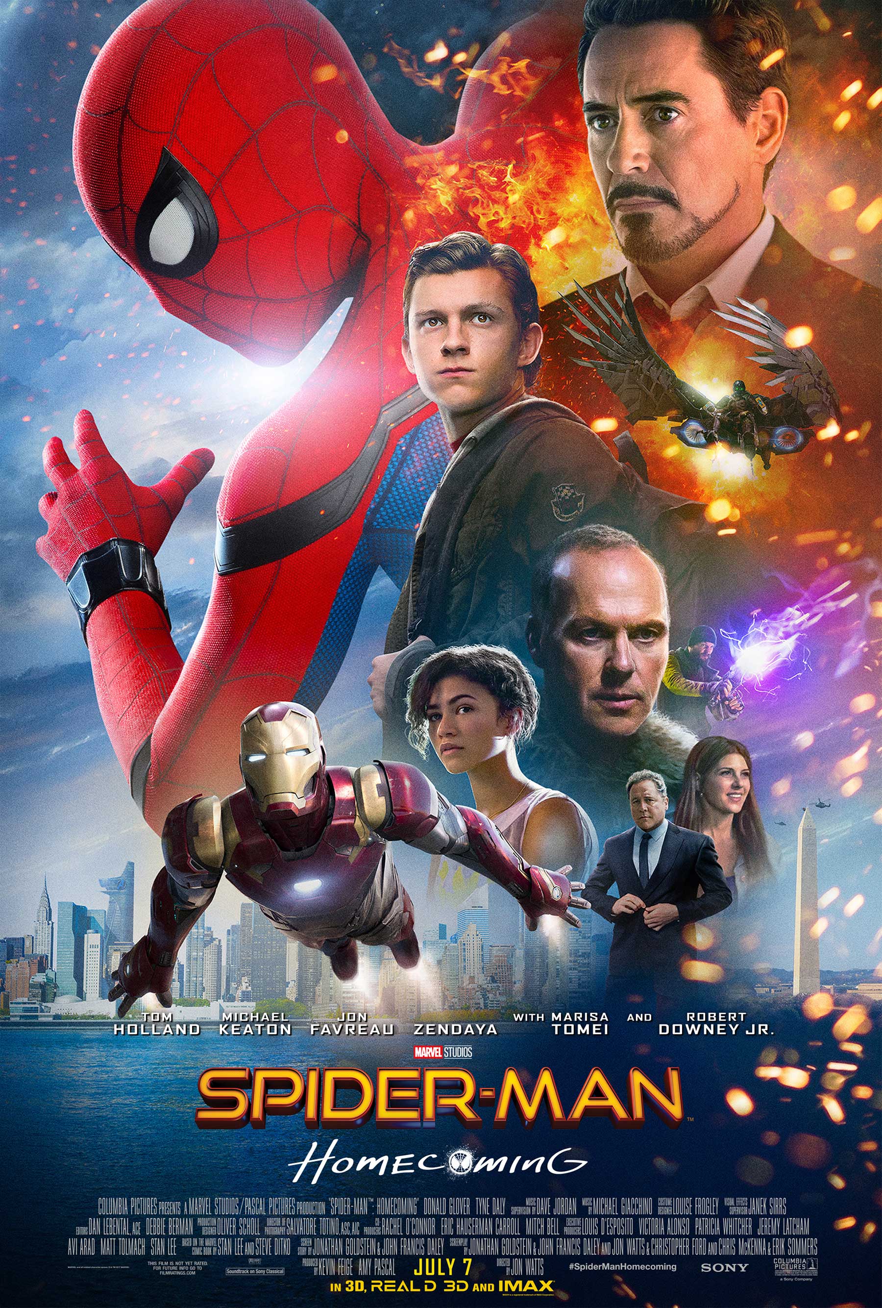
 the camera shot that was used in this film poster -long medium shot as u can see mainly just there wastes
the mise-en-scene in this is:
setting/background: they have involved quite a lot of the main characters for the background but the setting behind them all is the city of New York to give a generic setting for a superhero .
costume :they have added very fancy costumes for the characters like the fact dresses suits and the three superhero costumes with a very high tech feeling to add to the feeling of it being New York and everything is high tech and rich .
font style:the font style can suggest its very bold and the homecoming below with spider mans face as a letter adds a sense of creativity and possibly engages the viewer .
the outfits and the title can suggest that spider man (a High school student ) is having a key point in his school life with homecoming coming up and all the characters are dressed fancy (ones without super hero suits ) for the theme .
facial expressions : their facial expression can suggest something is to happen in the movie as most of their faces are serious as if they're focused on something ?
editing: the suits
and power sparks suggests its a high action movie with high advanced technology due to the mn with the wings flying and iron man flying in a expensive suit by what it seems to look like -linking back to the costume
overall u can tell its a action superhero fiction (as this doesn't happen in real life ) and its based towards a teenagers view point as the focus seems to be about high school which can gain a lot of possible viewers who are intrigued about these kind of subjects

Excellent analysis Scarlett using accurate terminology.
ReplyDeleteChallenge: can you link the actors to the genre?