01/05/24
nea introduction
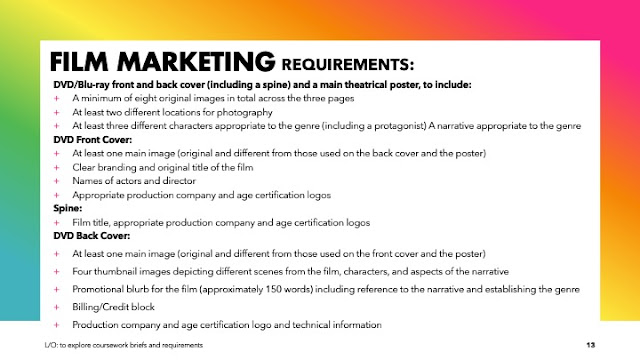
L/O: to explore coursework briefs and requirements
-film marketing-
dvd cover and theatrical poster ( horror theme) 


example of horror movie DVD
- front cover -
2). the font type is sans-serif and the title is " THE PURGE"
3). The tagline shows " one night a year , all crime is legal" emphasising what the movie includes and gives a basic description without sharing to much .
4). the colour pallet used is black, white , red , yellow which helps to give a horror effect with red words and the other dark colours helps emphasise the creepiness and scary feeling .
5). other information included in this DVD cover would be , the blurb showing the plot of the movie , billing block and the company that owns the movie ( universal studios) which is all included at the back
6). the text is all sans-serif and varies in size , the titles and the phrase sharp and shocking are the largest piece of text while there also includes red text with the tagline . and at the back of the cover there is information such as the blurb and billing block in smaller text
7). the genre is shown throughout the colour scheme and imagery , also the props used in the image. The creepy smiling masks help show the horror genre and also the characters on the back holding bats and weapons and the red , black and white colours are usually stereotyped with horror movies making it easier to guess the genre. Another way the genre is shown would be the movie scenes shown at the back the characters hiding, showing that they are scared .
- back cover-
1). the main image on the back shows off ,the shot type which would be a long shot showing off the multiple characters while it fades of into white showing off the scene images .
2). overall 4 thumbnails are used on the back showing off scenes including some main characters and more people with masks .
3). The images suggest the narrative includes a lot of hiding and intense scenes due to one of the characters hiding and the scared expressions on there faces
4).
5).information that the blurb give off is a Basic description of the movie , how america has a 12 hour period where all crime is legal and how a family goes through life threatening events through out the night.
6).The colour pallet used includes: black , white , red and features of yellow with the main image. The red can help give connotations of blood and gore and the black and white can give a creepy contrasting feeling.
7). other information included is the billing block , how its a dvd and who owns it ( universal studios )
8). the font type on the back of the dvd cover includes - sans-serif through out the whole back of the dvd cover it is different sizes and fonts but all particularly sans-serif
9). people have been represented in one main way . the cover only consists of white people but most people in the cover consist of people in masks not showing off there race etc . the cover consists of an even amount of gender appearances with one of the main characters ( Ethan Hawke as actor)
and the female murderers and lastly the daughter and mother.
front cover-
1). the shot type consists of a medium close up of one of the main characters in the story ( the bad guy ) and shows off his top half of his outfit , part of his hat and his mask with a creepy smile plastered onto it making the character look creepy and to allow the audience to recognise that he is possibly the bad guy in the story..
2). the title is called " THE BLACK PHONE " and it is presented in a sans-serif font
3). The tagline is " never talk to strangers " emphasising the main point of the movie
4). the colour pallet used includes of : red , grey , black a white which can give the connotations of blood
5). Other information included would be the billing block and the blurb describing the plot of the story
6). The font used throughout the whole dvd cover is sans-serif but the billing block and blurb are both in different fonts while the title on the back and font are the same and they are all different in size
7). The genre is shown through the colour palette and images - the colours red and black just overall a dark colour scheme is usually stereotyped with horror so people will automatically think it is horror while also the images with the masked man and the young boy at the back shown to be in a dark and rotting room helps emphasise that it is also a horror genre
Back cover -
1). The shot type would be a mid shot as it is showing his upper waist and the surroundings behind him aka the main prop ( the black phone )
2).There is four thumbnails shown in the back cover , two of the main character and two of the bad guy in the movie which gives of where some of the scenes are located in some sort of dirty run down basement in the villains house emphasising the boy has been kidnapped
3). The images help suggest that the narrative is the little boy being kidnapped and put into his basement as it shows him in a location with a black phone in the background
4).
5). the blurb gives of main information about the plot such as how the little boy in the plot was kidnapped and has to survive .
6).the colour pallet includes : black, red , grey , white giving off generic horror
7). other information included would be the billing block , who owns the movie , produced by etc
8).the font type on the back of the dvd is shown to be sans-serif which is common with horror movies .
9).people on the cover are represented in diverse ways , for example there is an older male and a younger male but meanwhile both are represented similar white males and no sign of ethnic characters in the cover.
08/05/24
NEA research
L/O: to research codes and conventions of similar products
-do now-
1). one main horror character , dark colours , jump scares , back story
2). blood ,

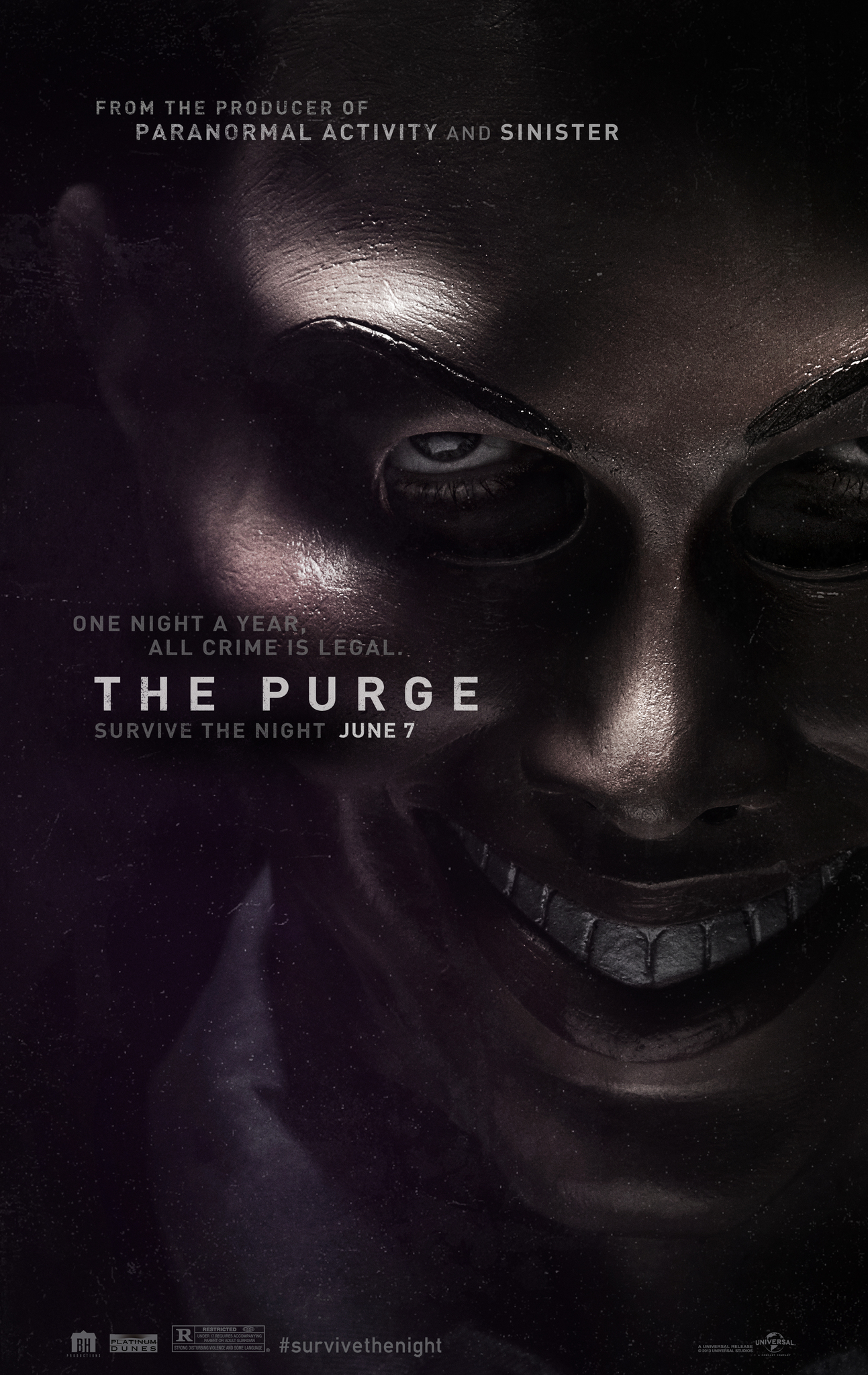
The purge theatrical poster
1). The main image is one of the characters wearing the iconic purge mask that is used throughout the movie
2). It has a basic layout that includes the main image covering the whole poster , billing block and release date at the bottom and title and taglines near the middle of the poster
3).logos included are : blum house universal studios etc and they are located at the bottom of the poster
4).the title of the poster is the purge in sans-serif font type
5).other information included would be the producers which is shown at the top of the poster , the release date and information about ownership and production / billing block at the bottom 6). The colour pallet used throughout the poster includes peach/yellow, greys black and white which helps make the character look sophisticated in the poster but the black gives an overall eerie feeling allowing the viewers to understand it is meant to be creepy and a horror movie
7). Different fonts are used but they are all sans-serif fonts although the billing block is more cooped up and packed together meanwhile the title is the biggest then tagline and production company on the tip of the poster .

The black phone theatrical poster
1). The main image is the main villain throughout the movie wearing the iconic mask that is linked with his character , this helps emphasis the creepy effect and allow the audience to make the connections that this is a horror movie .
2).the poster has a generic layout although there isn’t a big billing block like usual posters - there is production at the top , title at the bottom and other information below the title , actor name also above the title
3).logos that are included within this poster is universal studios and others contained at the bottom left of the poster
4).the title is called the black phone and is presented in a sans-serif font type
5). Other information included would be the production company , actor names , release date and tagline shown to be at the bottom of the poster
6).the colour pallet shown includes , red white black and grey which can give the connotations of blood darkness and in general they are colours in which people connect with the horror genre overall
7).overall the same font type is used throughout the whole poster sans-serif meanwhile the only big thing on the poster is the main title and the production info and tagline are similar sizing in a red coloured font
10/02/24
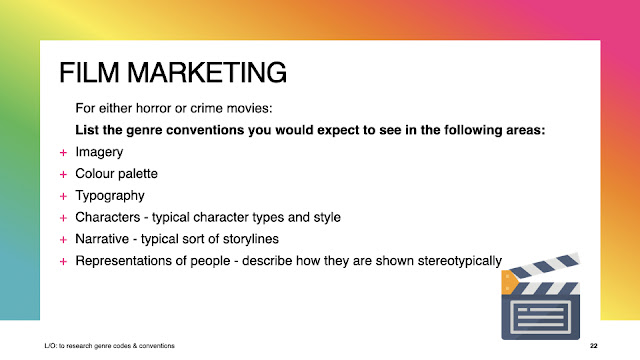
L/O: to research genre codes & conventions
do now
1). horror
2).use some elements from horror movies like dark colour schemes and scared emotions on my characters face on the thumbnails
3).some scary character on the front cover.

1). the conventions that would be expected in imagery would be : rather a close up or mid shot of a specific character/s with usually a scared expression or creepy .
2). the colour pallet that would be expected in horror movies would include dark colours like red , black and whites and greys to link with horror and the scary effect . also people will connote those colours with horror.
3). Typography that would be expected in horror movies would include sans-serif fonts that are bold to stand out on the dvd cover
4). most characters that are expected in horror movies include: the final surviving character/s , the best friends and the main villain in the movie
5). an overal narrative of a horror movie would be described into three parts: the starting appearance of the main villain and introduction to characters etc , then the villain making their appearance known to the characters to start of the future events , and then the final confrontation with the characters and villain usually ending in death or distraction
6). the representation of people is shown through skin colour sex and how they are represented through the movie such as a white main protagonist or a black main character as well but usually stereotypically in movies there is mainly white main characters and ethnic characters are usually side characters or die within the plot but that has changed more due to modern day perspectives and opinions .
15/05/24
do now
how things/ people or subjects are shown throughout a piece of media like blood can be red and sadness can be blue and like the representation of teenagers involve stereotypes . How text, gender , ethnicity , national and regional identity , social issues and events to an audience . this is done throughout shot type , and mise-en-scene .
17/05/24
do now
primary research is research you find from yourself and find first handed data .
secondary research is what you gain from existing data and other peoples views .
22/05/24
do now
1). what colours remind you of horror movies
2). what shot type would you expect in a horror movie
3).
05/06/24
questionnaire responses
-research conclusion -
1). the genre i have chosen is horror for my film marketing , this would appeal to an audience with an age range of 16-24 as they are old enough to see any 15+ age rating movies and might enjoy the genre overall
2). my target audience as a whole other then just age range would include : gender - non specific, interests - horror movies , cinema and overall categorised between , experiences and strivers
3).
4). my film will be about a group of friends facing paranormal activities
5).
6)a style i am going to have on my poster will be creepy , dark colours and a sans-serif font
07/06/24
target audience
L/O: to research our target audience to enable successful targeting
do now : demographics - fact and things ( job , race , gender etc.)
psychographics- characteristics , hobbies
NEA planning
L/O: to plan an effective product aimed at a specific audience using appropriate does and conventions
deadline 17th october
- take photos outside school - 20th september (can do on weekend)
- finish dvd design and edit photos -20-27th
- add age ratings and blurb, billing block etc . 20th
-start poster design . 27th
work on everything that needs improving or anything missed 4th-11th
13/09/24
do now
1).16-24 year olds
2). a horror dvd and film poster
3). dark colour scheme, include characters around the same age range as the audience- different genders, include many images
17/09/24
do now
raheem sterling - football player on the magazine for GQ
malala- a famous role model who was shot in the head
GQ: gentlemen's quarterly
vogue: fashion magazine aimed at females
masthead : the title shown at the top or bottom usually the name of the thing
20/09/24
do now
1). because before vogue was shown to represent stereotypical fashion and did not include many different ethnicities so having malala in the cover is unusual.malala is not a typical choice for vogue and she is not a model.
2). middle aged men who are interested in lifestyle magazines and men's fashion and are middle class
(ABC1 men).
3). broader age range of females who are intrigued in fashion and celebrities ( ABC1 females- high earners).
4). anchorage the use of words to give meaning to images such as captions headlines and taglines.
5). the main cover line is usually the more noticable bigger speech in the front cover to attract the audience or to show what the magazine includes.usually links to the main image.
24/09/24
do now
1). 1950's
2). major quality , miss sweetly
3). middle/upper class working class - quality streets aim at
4). mise-en-scene , connotations, camera shot type ,colour palette , language
5). gender , age , ethnicity
27/09/24
do now
1).B
2).lexis : words used and their connotations
3).font type , size
4). costume , facial expressions , colour pallets, props
5).cgi : editing
01/10/24
do now
1). A
2).sweating like a pig feeling like a fox
3).ideology:viewpoints, beliefs , attitudes , values
4). intertextuality: the referencing of one media text within another .
04/10/24
do now
1).font size , colour , style
2).2021
3).action
4).referencing other pieces of text in another
5).presented in a feminine way - stereotypical but are shown to be holding weapons - anti-stereotypical ( showing they have some power within the movie)
08/10/24
do now
1). roger Moore
2). 1974 - the man with the golden gun release
3).the global energy crisis - nuclear power station
4).Daniel Craig
5). represented in the male gaze very sexualised
11/10/24
do now
1).the British board of film classification
2).12 is dvd 12a is cinema
3).promotion. production , distribution , exhibition
4).promotion-marketing = distribution
5).covid-19
25/04/25
do now
1). 16-24 year olds
2).a dvd cover back and front and a movie poster
3).dark colours , young characters ,
4).


No comments:
Post a Comment