1.12.23
advertising & marketing
L/O:to explore the aims and conventions of print advertising
advertising: the main aim of advertising is to bring attention to a product, service or issue
adverts can be used to communicate a clear message about the product etc but it might be to raise awareness , inform or educate and to persuade audiences.
 this can raise awareness due to the man screaming and the baby in the back seat showing the viewers to be more careful in the road or else accidents can happen
  this advert warns the user and informs them in what happens educating them to eat correctly and organically
  this advert persuades the audience to taste there drink by exaggerating it and making it seem as if it will bring happiness
  this advert has a unique selling point showing off the fact it removes all noise and promoting its on a sale.
 .
.-----------------------------------------------------------------------------------------------------------------------------
8/12/23
Historical Advertisements
L/O: to explore historical adverts and their codes and conventions

10/01/24
historical advert set text
L/O:to explore the context and representations in the historical set text

do now.
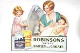
1). firstly the man looks as if he is very rich and fancy but the ladies seem to be kissing the mans cheek but are focused on the quality street showing they simply with the man for the chocolate
2).the man looks to lead a very established life as he is dressed fancy and has two ladies by his side, and has a high luxury lifestyle which means that they can afford certain things in life and
3).that there product is good and everyone enjoys them and the use of the fancy man makes it seem that high paying men would enjoy quality street .
1950's context :
the 1950's saw a change in high culture where entertainment and the arts became more accessible and affordable for everyone
advert 1 :
making it seem like a women is meant to clean or as if there purpose is to clean . the advert is aimed at men normalising the idea that women have to clean to others
advert 2:
once again normalising that the women have to do household jobs and saying that its a women's job
advert 3: the men in the advert are rather playing or just laying around meanwhile the females in the advert are doing work again and showing basic stereotypes like wit the boy wearing blue and the girl wearing yellow which is more stereotyped in girls
advert 4: the phrase keep HER is objectifying the lady saying she has no name
advert 5 : the women is once again working for the man and subjecting to the man
advert 6: its suggesting that the women isn't capable of cooking food without burning it and that a beer is the mans only worry connoting his wife is doing all the household work.
gender roles back in the 50's where shown to be more of a patriarchal society with each gender having specific gender roles. Men where shown to have more power by going to work in fancy suits and having the women stay home to do stereotypical things like cleaning and taking care of the children or in general shown to subjectify to the mens needs and commands making the 50's look like the world was shown in the male gaze with the men on top . Fashion choices also add to this by having shown that women where always dressed in fancy dresses with makeup and jewellery to look nice and please a man meanwhile the men always wear work attire
the man is framed at the centre of the image giving men a more powerful and greater look saying how there more stronger and superior to women . and the man is wearing a suit referring to how the man is in business suggesting he is wealthy and has the power and works. the women in the image are shown to be
12/01/24
historical advert set text
L/O: to explore the possible exam style questions for advertising
do now
the male gender
he is shown to be very wealthy - powerful etc
he is framed at the centre of the advert
the women are being objectified as sweets giving it an idea of like the man gets to pick .
the audience are positioned to see all the characters in the adverts in a male's perspective, for example the women in the magazine have been objectified with their outfits which link towards the colours of the sweet wrappers giving the connotations that the women are choices and options like the quality sweets undermining women's appearance in the advert. The women's outfits. are shown to be very formal and presented showing off women to be presentable and tidy for others.
meanwhile men have been presented quite opposite in the advert. For example the man shown in the advert is framed in the centre of the frame giving connotation's of importance and power by being the main focus of the advert. Another would be us the use phallic symbols shown in the advert , the quality street box of chocolates is on the mans lap and it shows the two females reaching for it hinting at phallic intentions one again connoting male dominance and power.The man is shown to be wearing a formal outfit of a suit to represent how he can afford luxury items and is a hard working man once again giving men the upper hand in this advert.
17/01/24
analysing adverts
L/O: to build the skills needed to analyse and evaluate adverts
do now
connotation: when someone/something is implying another thing ( lion= power)
denotation: the literal meaning of something .
advert 1 :
connotations : UK guards used suggesting protected and safe
advert 2 : ironic because its meat but suggesting its better then meet and can be to good to handle also suggests that the big mac is being compared to a woman - sexist advert
advert 3: suggesting that its like a race car used on the road and number 1 - the text and the picture implies it by having older race cars used inside the audi
advert 4:
its suggesting that the bandaids are good for the hulk a big strong superhero - who breaks everything comparing the strength of their product to the hulk the green muscly hand suggests its the hulk
positive. negative
interested, inquisitive , curious , disabled nosy, crippled , retarded, handicapped
barbie , cola , disney , explorer , facebook , google, honda , Kellogg , lego , mc Donald's , nintendo , oreo , pinterest , Reece's , skype , twitter , virgin airlines , Wikipedia , x box , yahoo , amazon.
homework
how does the quality street advert use the layout and design to create meaning?
The quality street advert creates meaning throughout the layout and the design in many ways , for example the structuring of the man in the advert. The man has been places in the centre of the frame and is wearing a fancy suit ( mine-en-scene) . this has most likely been done to emphasise the wealth of the man and make the man look more powerful. meanwhile the women are shown to be wearing the colours of the sweets objectifying the women and making the magazine look like it was shown through a Male gaze.
language
the language used in the quality street advert shows many things , for example the phrase"what a delicious dilemma" this has been used to connote to the women included in the advert suggesting that the man has to choose between the women and that there sweet like.
19/01/24
Persuasion in adverts
L/O: to build the skills needed to analyse and evaluate adverts
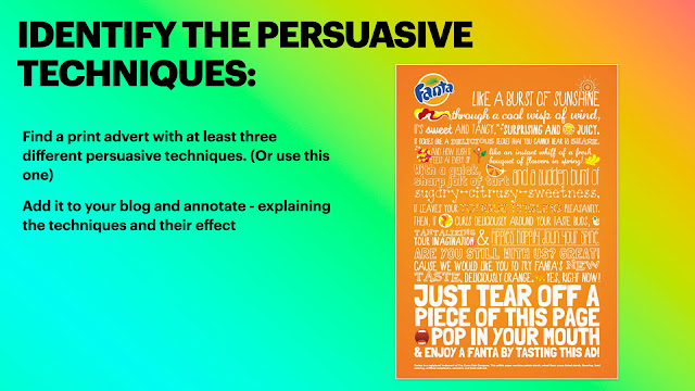
in tis advert it contains the following persuasive techniques :
emotive language - ' a burst of sunshine ' wisp of wind"
direct adress" pop in your mouth "
repetition of the word sweet tangy
24/01/24
contemporary adverts
L/O: to understand the techniques used in contemporary adverts
do now
males- blue , green , red
girls - pink , purple , yellow
girls attitude: shy , polite , sweet
boys : brave , hard working , strong
patriarchy
women are shown to have the stereotypical roles of wives and mothers
meanwhile men are the providers and hard workers .
women wear lots of makeup and fashion
men are more intelligent
women are creative.
the brand identity of fiat
fiat seems like a very light hearted , perky brand that expresses their cars in optimistic way and have something for everybody . and take dedication in there style and appearance of their cars
also they are making there adverts look like a fashion catalogue
how is media language used
the two adverts are aimed at different genders by the way its phrasing there adverts for the female it involves fashion and the car is described as a retro accessory and stereotyping the women making her obsessed with her looks.
meanwhile with the man they have described the car in a sporty way connoting to the mens stereotypes with sports and
HOMEWORK ON MISSES BLOG!!
26/01/24
creating adverts
L/O: to use our understanding of advert conventions to create advertisements
do now
the main image
logo
slogan
what the advert is about
product shop
anchorage text : tag line etc persuasive text


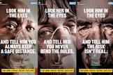

why hold it when you can wear it ? - umbrella hat
dont spill it just dip it ?
- didn't get the bacon one -
this might make killing and grilling a little bit more fulfilling.
Homework
This girl can
It is a campaign started by sport England to highlight those girls who do there sports without caring as to what they look like even if their sweaty and it’s target audience is primarily targeted at all women up to there 60’s involved in sports or anything like that , created January 2015 and is funded by the national lottery and a very well known campaign.
women in advertising
L/O: to evaluate how women are represented in a variety of adverts , so that we can apply this to the set text for the exam.
this data shows me that in conclusion more girls are less confident in trying knew things and sports and that boys and girls equally enjoy p.e and participating . but most girls aren't very interested in. watching but some do sports outside of schools as an activity
this girl can : launched 2016 funded by national lottery - means this campaign was not to make any money the purpose of this campaign was to break down the primary barrier holding women back from sport - the fear of judgement . before this there was a massive gap between men and women participating in sport with 2 million fewer 14-40 year old women then men partaking in a regular sport activity.13 million women said they would like to do more. just over 6 million were not active at all . fear of being judged was the number one barrier for most women who felt they were unable to participate in physical sports .
as a result of this campaign 1.6 million have started exercising and the number of women playing sport and being active is increasing faster then men .
the message it conveys is that women shouldn't have to feel ashamed in themselves when doing a sport or activity and are free to do whatever they want .
two print adverts that stick out to me :
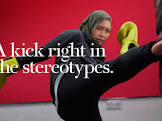 - this advert because it mentions stereotypes of women not being able to fight and partake in fighting activities cause they are weak and aren't capable but this advert goes against it by showing she can and mentioning she is going against the stereotypes.
  - this advert is showing the audience that the girl in the image isn't bothered that she is playing football and isn't bothered what anyone thinks by telling them to deal with it . this shares a message that women can do anything they want and don't have to be bound by society rules .
 advert 1- nike advert : women are being represented as strong and the advert has focused on the women's strong figure .
nike advert 2 : this advert is setting a mood for encouraging women to be more active and to reach full potential.
adidas: this is representing women or this girl in particular to be the top of her game and is very good at what she does once again making women seem like they are capable or doing stuff and encouraging them to do there best .
all of them : they are making women stereotypically strong in there adverts and are using athletes and girls who do it constantly in the main images and the girls are already good at what they do in these adverts . 
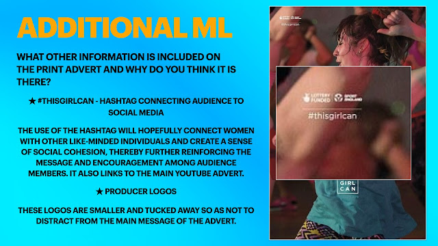
. explore how the print advertisment for this girl can uses media language to create meanings:

this girl can adverts are very different to the nike and adidas adverts shown representing women in many ways. for example in the nike adverts there models in the main images are very slim and muscular and shown to look clean and neat , meanwhile with the this girl can adverts their model is shown to be very sweaty and tired out making their advert look more natural and less fake showing the reality towards sports and going against the neat and tidy stereotypes of women.The nike adverts do show a encouraging slogan advertising women to try harder and if they put effort in they can achieve more . But on the other hand the this girl can advert uses the phrase "sweating like a pig , feeling like a fox" this emphasises that women can become sweaty and gross just like every male as well but they are showing that the women feels confident and sexy doing so emphasising that women shouldn't have to feel as if they are gross and ugly while doing sports and activities but to enjoy them and not care about what others think .
02/02/24
advertising set text #2
L/O: to analyse the construction of the this girl can set text
do now
how does that advert target a wider range of women then just the this girl can print poster ? - the advert targets more people by including a variety of women in the advert with different body shapes and ethnicities etc meanwhile the print included a minimum of 1 person and a phrase targeting some but not including a variety like the advert .
sweat: gross , smelly , dirty
pig : loud , dirty ,
fox: mischievous, quick , 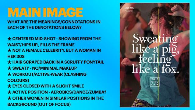

they have used this phrase to flip the negativity of a pig and sweat and change it to more of an encouraging feeling to try and send the message that women dont need to be ashamed in sweating or doing exercise and to just do it and enjoy doing what makes them happy.
the font style on the print advert , they have used serif for their print advert to make it look more of a feminine font and to make it look more neat and tidy
women in her 30's : they have used a women in 30's to make it seem more normal instead of using a celebrity so it can make the users think they are reliable and true to their campaign
hair: they have made her look like that to show she has been working hard and moving so her hairs all messed up
sweaty: this was done to once again emphasise that the model has been working hard
eyes closed with a smile : they have done that to show she is enjoying what she's doing and doesn't care about anything else in the moment
active position : this was done to emphasis that the campaign is trying to help more women get into doing activities
other women in similar positions: to show that the model is in a sports class currently doing an activity.

two similarities and differences : quality street , this girl can advert
differences : one is made for sweets and one is made for activity and sports
difference: the girls in the quality street advert are shown to be neat and tidy and presentable meanwhile the girl in the this girl can advert is she is sweaty and gross .
similarity :
09/02/24
c1 section a PPE
L/O: to practise how to answer exam style questions effectively
do now
- confidence
- encouragement
- anti-stereotypical
- empowering
-free
dominant ideology : attitudes beliefs , values and morals shared by the majority of the people in a given society
question 1 : this girl can
. explore how the print advertisment for this girl can uses media language to create meanings:
A). text/written language
- connotations , specific example from the text
The print advertisment for this girl can uses language to create meaning in different ways , for example the simile in the centre place " sweating like a pig feeling like a fox." The campaign is trying to structure in there advert that the model is feeling confident in the situation presented and isn't bothered by the fact she is sweating a lot . The noun pig can be used to describe or connote many thing but is mainly used in an overall negative term such as ; ugly , sweaty , dirty etc. Meanwhile the noun fox has different connotations such as : confident , sly, sexy . The campaign has used these terms but juxtaposed them together to link with the campaigns main aim , to encourage women to get into sports and to prevent women from feeling anxious and self-conscious and they have done that by showing the model in the print advert does not seem bothered and is in fact confident and happy with herself and making the phrase pig have an overall different meaning by adding the word fox giving the phrase a positive outcome.
Another way that the campaign has created an effect with its language would be for example the #ThisGirlCan placed in the top left corner of the print advert.This phrase has many positive connotations such as the word can, this word has many positive connotations like ; opportunity , achievement and success. The phrase has been used for the campaign overall as it creates a positive movement and the use of the # helps over boost it in there social media posts and if others help boost it as-well.Once again highlighting what the campaign is trying to aim overall , trying to encourage women of all shapes and sizes etc to engage in a sport and to not feel ashamed with themself.
b). - visual codes ( for example images, lighting, dress).
The this girl can campaign aims to encourage women to involve themselves in sports and to feel less negative with themselves and to feel less anxious in doing sports.
For example, the way the models facial expression has been structured . The model in the print advert is shown to be smiling with her eyes closed emphasising that she is in her own world enjoying herself without paying attention to anyone .This helps achieve the campaigns main goal as it is showing that she is confident and happy in what she's doing which is what the campaign is trying to boost and by making the model seem happy and proud , it can effect others to do the same .This is usually done throughout print adverts to attract a audience and emphasise the confidence
Another point would be the use of her clothing in the print advert. The model is shown to have some very colourful patterned outfit with a bright blue top. This could have been used to go against stereotypes targeted to women and to make her stand out more . With the top the colour blue was aimed mostly towards boys , so the campaign has gone against the usual, highlighting the affect its trying to have by having her wear those colours . Meanwhile those colours used can also highlight confidence and standing out emphasising the campaigns message and what t wants its users/viewers to think and act out . Usually this is done to emphasise anti-stereotypical views in print adverts and is being shown more and more as society progresses
On the other hand , another noticeable feature shown would be her pose. The model in the centre of the page is shown to be posing in a dance/sport type of position emphasising that she is working hard and doing a sport she loves which shows she is being successful and achieving her best. By doing this the campaign is giving the effect towards its users to do what they want to do without caring about others opinions and to just get into a healthy lifestyle overall.
21/02/24
C1 section A PPE
L/O: to revise how to answer exam style questions effectively
PPE Q1a: 4/5
WWW: Excellent points well explained and supported
EBI - link the points to the meaning/purpose of the campaign
PPE Q1b:8/10
WWW: good focus on the meanings constructed by the visual codes
EBI: add in whether the elements you mention are conventional for print adverts or not
WWW: Excellent points well explained and supported
EBI - link the points to the meaning/purpose of the campaign
PPE Q1b:8/10
WWW: good focus on the meanings constructed by the visual codes
EBI: add in whether the elements you mention are conventional for print adverts or not
ADVERTISING REVISION HOMEWORK - 11/03/25
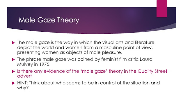
The quality street advert was made in the 1950’s. This time period influenced this advert majorly, for example we can see the male is primarily the focus of this advert and is shown to be wealthy and attracting the females within this advert.The ideal that society was more patriarchy during this time so men were more dominant. And within this time woman were seen as prizes and “eye candy” for males hence why in this advert the popular sweets represent woman and that they are overly sexualised within this advert. Historical context has influenced the way the characters have been represented within this advert due to society’s expectations and stereotypes.
HOMEWORK- social and cultural context influencing this girl can advertisements 25/02/25
Social context has influenced this girl can in many ways, through the time of the this girl can advertising society experienced as a whole a lack of confidence and shame. Most importantly females within society, they felt as if they couldn’t express themselves nor feel confident enough to do the things they wanted like for example go out and exercise due to how they viewed themselves. Because of this the this girl Can advert was influenced to help support this women by creating adverts in which used influential messages to help empower women for example the phrase “sweating Like a pig feeling like a fox” represents the realism in it but boosts the self confidence woman should have within themselves for be able to get out there and do activities and the image included represents a middle aged female who is shown to have a big smile on her face giving the connotations that she is happy and confident in what she is doing which expresses the positive message to others that they should be more confident in themselves!


Good notes on aims.
ReplyDeleteCheck the notes for conventions
QS ADVERT:
ReplyDeleteExcellent notes and understanding of context, the use of ML & representation
QS HOMEWORK:
Good answers with detailed references to support. Well done
THIS GIRL CAN ADVERT:
Good notes and understanding of context, the use of ML & representation.
PPE Q1a: 4/5
WWW: Excellent points well explained and supported
EBI - link the points to the meaning/purpose of the campaign
PPE Q1b:8/10
WWW: good focus on the meanings constructed by the visual codes
EBI: add in whether the elements you mention are conventional for print adverts or not
HOMEWORK: excellent. Spot on.
ReplyDeleteCONTEXT HWK #2
ReplyDeleteExcellent - well done!