29/11/22
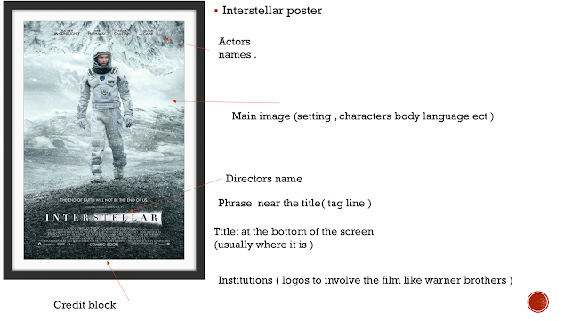
do now ( film poster analysis )


 action film poster analysis

action filmposter


a lot of action film poster include the main characters standing with a full body shot or it shows half
normally it includes a contrast of bright colours in the background which relates to the movie
less important characters seem to be smaller in the poster and ones that affect the movie the most tend to be bigger
the title goes along with the colour scheme like red , yellow , black
release dates are normally at the bottom mainly with marvel they have their logo above the title and focus more detail into the characters
1/12/22
do now : genre
tron: sci-fi as it looks more futuristic and the characters seem to be wearing odd looking backpacks (that could possibly be hinting to sci-fi) setting also looks futuristic
judgement of paris : action , it seem to have a lot of fire in the background and the character looks as if he has been in a fight - the font is also a dirty messed up style
pans labyrinth :horror or adventure or fantasy - it has a contrast of dark blues and blacks but the girl in front of the very odd looking arch suggests that she could be on an adventure to find something


